Garrison Group
A strong foundation. A distinctive identity.
Midwest commercial real estate advisors.
The partnership
Built on experience.
Ready for a new chapter.
Garrison Group has a history of commitment and dedication to clients throughout the Midwest. During a season of expansion, transition, and growth, the firm wanted an identity that better reflected its expertise and professionalism.
We partnered with the team to provide creative direction and build an adaptable brand system that could support the business for years to come.
The mark
Architectural lines.
An unmistakable G.
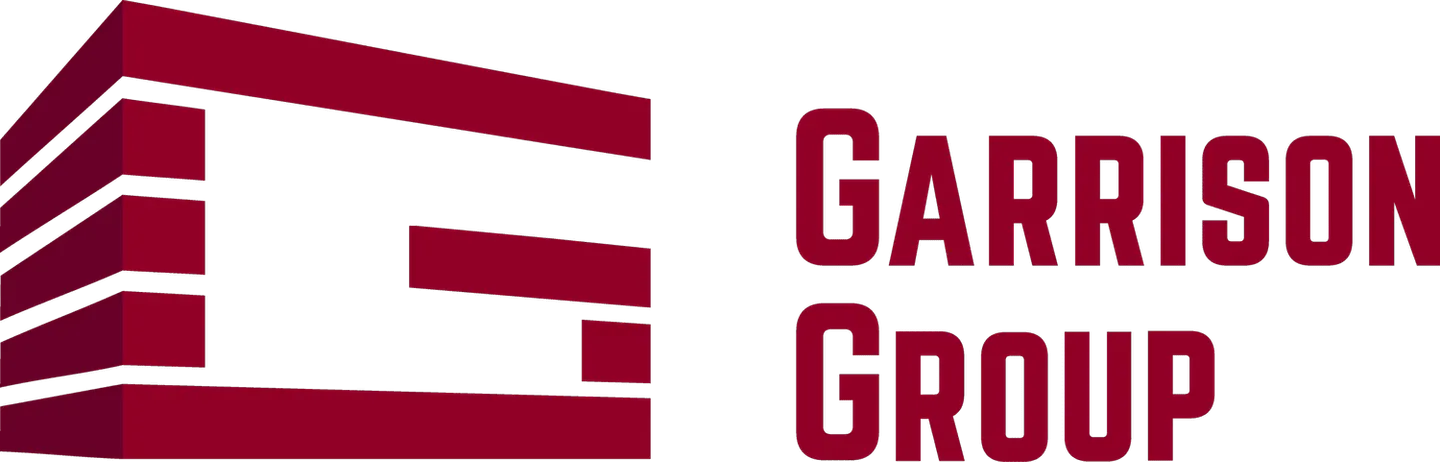
The symbol combines the initial with bold, building-like forms. Its stacked lines give the identity a structural character that connects naturally with commercial real estate.

The visual system
Bold where it matters.
Clear in every detail.
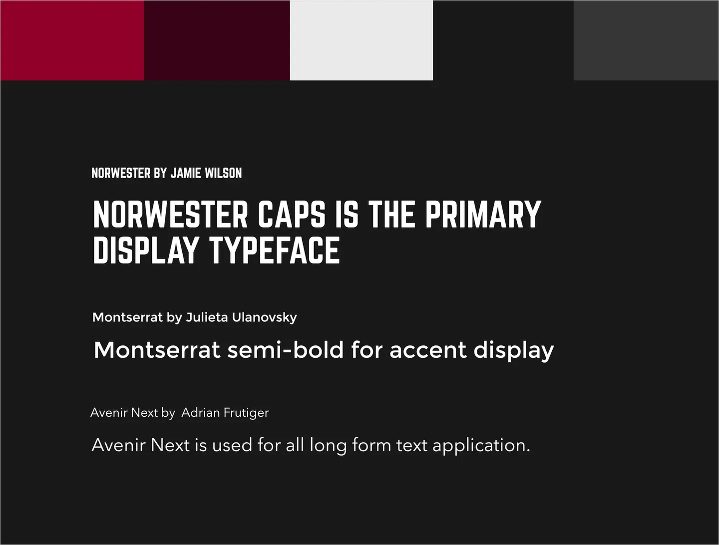
Deep burgundy, charcoal, and light neutrals establish a confident palette. Condensed display typography gives the brand a strong voice, balanced by readable supporting type.

The result
A cohesive identity.
Made to move with the business.
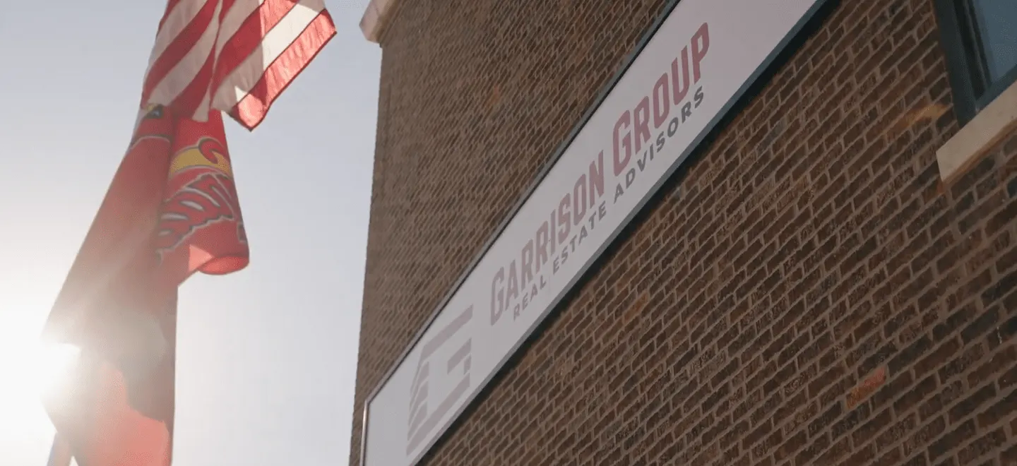
The rebrand brings the firm’s professionalism into a consistent visual language. From building signage to team apparel, the mark and supporting system give Garrison Group a recognizable presence.